
|
I can’t believe it’s already almost August! This summer has both flown by and seems like it’s lasted forever. Towards the beginning of the summer (more specifically on June 2), I looked at COVID-19 statistics of various countries, and now that summer’s almost over, I thought it’d be interesting to gather the same statistics and compare them! I’m curious to see how the distribution of COVID-19 cases has changed through time. The statistics I used were COVID-19 confirmed cases, and to focus on the older population, I compared the proportion of COVID-19 cases in the 60+ age group with the proportion of people 60+ within the whole population. Basically, I did (# of COVID-19 cases in ages 60+ / total # of COVID-19 cases) - (# of people 60+ / total population). I subtracted the proportions in order to compare the statistics more easily between countries, and I will call the difference in percentages the “delta”. I actually did this for different age groups (60-69, 70-79, and 80+), but for this post, I decided to just focus on the comparisons between countries. The countries I used are Japan, Sweden, New Zealand, Australia, Spain, and California (which I know is a state, but I wanted to compare to somewhere in the US, and the US groups the cases from age 65, not 60). Here’s the data from the beginning of June (6/2): 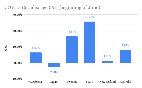 The more positive the delta, the more “exposed” the elderly are to COVID-19 because this means that the proportion of elderly with COVID-19 is greater than their share of the total population. In comparison to the other countries, it seems like the elderly in Spain and Sweden were most exposed because they have the most positive deltas. California and Australia were a little better, and Japan and New Zealand had deltas closest to zero, meaning the proportion of cases is around the same as the proportion of the total population (and Japan actually had a negative delta!). Here is the data from yesterday (7/25): 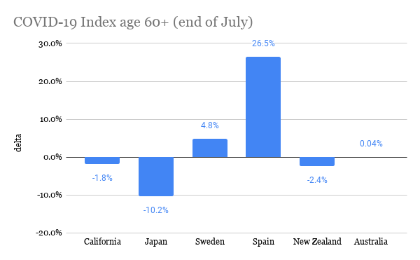 It’s interesting to see that for every place, except Spain, the delta decreased, and pretty significantly. This means that the proportion of elderly cases of COVID-19 became less compared to other age groups. I think Spain is an exception because during this time frame, the peak of the pandemic was already over in Spain, so there wasn’t much change in the distribution of COVID-19 cases. However, if Spain’s delta stayed relatively the same, then shouldn’t Japan’s, too, because Japan was one of the first countries where COVID-19 spread to (as measured by the date of the first confirmed case)? Since the beginning of July, Japan has been seeing a spike in cases, and many of the cases are within younger age groups. Australia has also had a rise in cases in around the same time frame. With less restrictions, younger people could be moving more freely, perhaps because they believe the risk is low or because of necessity, like for work. On the other hand, older people may be continuing to stay home and be cautious because they recognize that the risk is still high for them. Spain is actually now beginning to see a spike in cases, so it’d be interesting to see if its delta changes. In both California and Sweden, there was never really an end to the first wave of the pandemic, but their deltas have still decreased. I think a similar theory could be applied to these places, too: as the pandemic continues and worsens, people realize the risks of the elderly obtaining COVID-19, and elderly people could become more cautious in order to lessen exposure to COVID-19. If this is the case, then it makes sense that the delta decreases because not as many elderly people are becoming infected, at least compared to other age groups in the country. For New Zealand, there have been single-digit new cases per day throughout the whole summer, and its delta has changed the least. It’s actually quite interesting to see how well New Zealand has handled the pandemic, and I’m curious to know what factors contribute to their success. This brings me to my conclusion: there are definitely many more factors that contribute to people’s behaviors in different places and consequently, the trajectory of the COVID-19 pandemic. Nevertheless, it’s interesting to find commonalities between places and explore potential theories for them. The sources for the COVID-19 data are the government websites for each country (and California's state website). I obtained population estimates from https://population.un.org/wpp/ and https://statisticalatlas.com/state/California/Age-and-Sex for California. Please contact me if you have any questions about the statistics!
3 Comments
Sher
8/3/2020 06:57:28 pm
:( This makes me so sad. I live in Cali and really dont understand why people are not wearing masks ALL THE TIME. 8/4/2020 04:59:19 am
This is a very interesting read and the data for the pandemic has been fascinating to me. I think what intrigues me so is that we as a society have unestimated the virus, I think it is a "smart virus" heck everything else in world is smart these days like tv's, phone's, homes, why not a virus? Leave a Reply. |
Archives
February 2021
Categories
All
|
 RSS Feed
