
|
Throughout the United States and across the world, a topic sparking much alarm and urgency is the disproportionate amount of COVID-19 cases in nursing homes and the even larger share of deaths. It breaks my heart to hear the news about these residences being devastated by COVID-19, so I looked into research trying to understand underlying reasons for this. I’ve learned that the inherent characteristics of nursing homes make them more vulnerable: residents likely have underlying medical conditions and the communal setting makes it easier for transmission. Previous research has confirmed that urban location and larger facility size of the nursing home are related to the nursing home having COVID-19 cases. After thinking, this intuitively makes sense: a higher population density makes it harder to social distance, and a larger facility means there’s more traffic of staff in and out of the nursing home. I also watched a webinar hosted by the NIA IMPACT Collaboratory, which affirmed that facilities with COVID-19 cases were likely to be larger, in urban areas, and in states with more cases.
After going through this existing research, I realized most studies are only on nursing homes. What about other types of long term care facilities? Less research has been done on the transmission of COVID-19 in other facilities and comparing the outbreaks to those in nursing homes, although there are many distinctions between the types of facilities, the main one being that nursing homes are more focused on providing medical care for residents. This sparked an idea: I wanted to visualize the different patterns of COVID-19 cases in nursing homes vs other facilities, so I created a map. The map consists of outbreaks in licensed nursing homes and residential care facilities for the elderly (RCFEs; encompass assisted living, memory care, and continuum of care communities) in Los Angeles County, and I also included layers to compare the cases within the racial composition and median income of the area they are located in. The COVID-19 cases are grouped by zip code in order to depict the outbreaks in a community as a whole.
Here is my first map of LA County (the case numbers are not being updated). The nursing home cases are displayed for all of California, while the RCFE cases are only displayed for LA County. To view the legend, click on the arrow button on the top left:
I also recently created a similar map for Austin, TX, with case numbers that are up to date. Here, the exact locations of long term care facilities with cases are displayed: A clear major difference between nursing homes and RCFEs is that there are fewer cases of COVID-19 in RCFEs. I think this could be due to the differences in care and living between nursing homes and RCFEs, like residents being more independent in RCFEs and staff providing less hands-on care. Furthermore, unlike nursing homes, residential care facilities are not federally regulated, but rather states set most regulations, so the quality can greatly vary between facilities. This also means that COVID-19 responses for these facilities can vary greatly between states— yet another factor that could contribute to the presence of COVID-19 cases. Therefore, there may be many more variables to consider with regards to COVID-19 cases in other long term care facilities than in nursing homes. As the extent of the spread of COVID-19 in a community contributes to its transmission into long term care facilities, it is everyone’s responsibility to protect the residents living in them. In order for us to understand this and take necessary precautions, we also need a clear picture of the COVID-19 situation of the long term care facilities in our own communities. Therefore, I believe it’s important to create visualizations of the long term care facility data that are easy and quick to understand and on a local level. This can help the general public to recognize where outbreaks occur, focus appropriate attention and resources, and consciously take action to lessen the spread of COVID-19 to those most vulnerable in the community. Sources
3 Comments
I can’t believe it’s already almost August! This summer has both flown by and seems like it’s lasted forever. Towards the beginning of the summer (more specifically on June 2), I looked at COVID-19 statistics of various countries, and now that summer’s almost over, I thought it’d be interesting to gather the same statistics and compare them! I’m curious to see how the distribution of COVID-19 cases has changed through time. The statistics I used were COVID-19 confirmed cases, and to focus on the older population, I compared the proportion of COVID-19 cases in the 60+ age group with the proportion of people 60+ within the whole population. Basically, I did (# of COVID-19 cases in ages 60+ / total # of COVID-19 cases) - (# of people 60+ / total population). I subtracted the proportions in order to compare the statistics more easily between countries, and I will call the difference in percentages the “delta”. I actually did this for different age groups (60-69, 70-79, and 80+), but for this post, I decided to just focus on the comparisons between countries. The countries I used are Japan, Sweden, New Zealand, Australia, Spain, and California (which I know is a state, but I wanted to compare to somewhere in the US, and the US groups the cases from age 65, not 60). Here’s the data from the beginning of June (6/2): 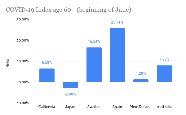 The more positive the delta, the more “exposed” the elderly are to COVID-19 because this means that the proportion of elderly with COVID-19 is greater than their share of the total population. In comparison to the other countries, it seems like the elderly in Spain and Sweden were most exposed because they have the most positive deltas. California and Australia were a little better, and Japan and New Zealand had deltas closest to zero, meaning the proportion of cases is around the same as the proportion of the total population (and Japan actually had a negative delta!). Here is the data from yesterday (7/25): 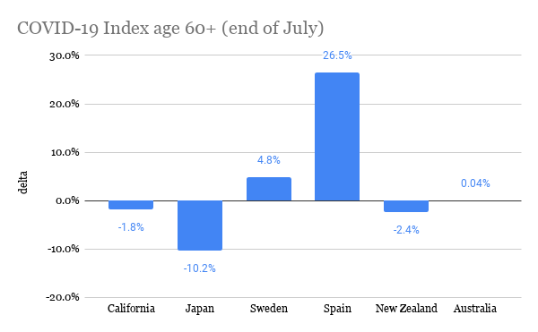 It’s interesting to see that for every place, except Spain, the delta decreased, and pretty significantly. This means that the proportion of elderly cases of COVID-19 became less compared to other age groups. I think Spain is an exception because during this time frame, the peak of the pandemic was already over in Spain, so there wasn’t much change in the distribution of COVID-19 cases. However, if Spain’s delta stayed relatively the same, then shouldn’t Japan’s, too, because Japan was one of the first countries where COVID-19 spread to (as measured by the date of the first confirmed case)? Since the beginning of July, Japan has been seeing a spike in cases, and many of the cases are within younger age groups. Australia has also had a rise in cases in around the same time frame. With less restrictions, younger people could be moving more freely, perhaps because they believe the risk is low or because of necessity, like for work. On the other hand, older people may be continuing to stay home and be cautious because they recognize that the risk is still high for them. Spain is actually now beginning to see a spike in cases, so it’d be interesting to see if its delta changes. In both California and Sweden, there was never really an end to the first wave of the pandemic, but their deltas have still decreased. I think a similar theory could be applied to these places, too: as the pandemic continues and worsens, people realize the risks of the elderly obtaining COVID-19, and elderly people could become more cautious in order to lessen exposure to COVID-19. If this is the case, then it makes sense that the delta decreases because not as many elderly people are becoming infected, at least compared to other age groups in the country. For New Zealand, there have been single-digit new cases per day throughout the whole summer, and its delta has changed the least. It’s actually quite interesting to see how well New Zealand has handled the pandemic, and I’m curious to know what factors contribute to their success. This brings me to my conclusion: there are definitely many more factors that contribute to people’s behaviors in different places and consequently, the trajectory of the COVID-19 pandemic. Nevertheless, it’s interesting to find commonalities between places and explore potential theories for them. The sources for the COVID-19 data are the government websites for each country (and California's state website). I obtained population estimates from https://population.un.org/wpp/ and https://statisticalatlas.com/state/California/Age-and-Sex for California. Please contact me if you have any questions about the statistics! Hello everyone! I've been doing some research about COVID-19 and the elderly population, and I would like to share my thoughts on a couple topics. The first one I'll be covering today is transportation. I found surveys from Japan and NSW that ask about the transportation methods the elderly use most often, and the results are summarized below: 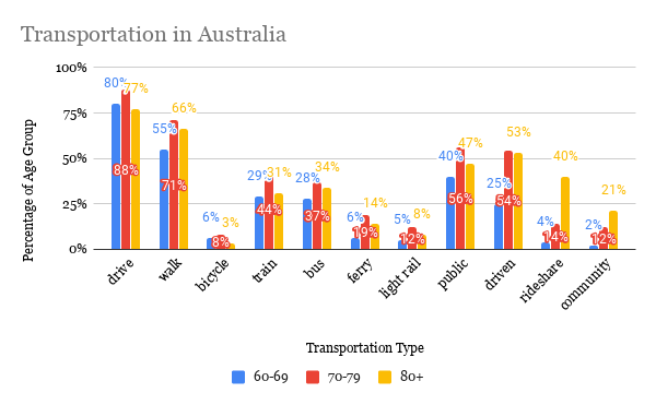 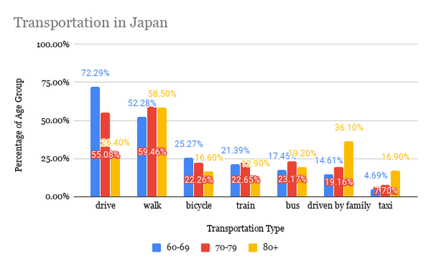 It is first interesting to look at the variance of transportation methods between age groups within the countries and also between the two countries. However, I should note that since the data come from different surveys, comparisons should be taken with caution. Here are some points that I found most interesting:
Now I will be looking at the data within the context of COVID-19. Both Japan and NSW imposed restrictions on going out and nonessential travel but are now reopening. The transportation method of focus is any type of public transportation (including point-to-point transport in NSW) because it poses the most risk for infection, as people are in close proximity to each other, and it’s a shared space. Although public transportation was not completely restricted in either place, the suggestions or orders to stay at home affect the usage of public transportation. It is reasonable to assume that overall public transportation usage decreased during this time, and this is evident through mobility trends data, like from Facebook, Google, and Apple. From the variety of transportation methods the elderly use in both countries, it’s likely that most individuals are able to adapt and use another transport method, like using a private car, biking, or walking, that pose less of a risk than public transportation. The population group that I’ve noticed that may have difficulty adjusting is the 80+ group in Australia. This is because while the percentage that uses public transportation is similar to the other age groups, another popular form of transportation is the point-to-point and community transport, which may pose a greater risk of infection. It could be that it's more difficult to find an alternative method of transport for the 80+ age group. Another consideration is the 80+ age group in Japan. Although the percentage of drivers decreases significantly, those who are driven by others, both by family and in taxi, increases significantly from the other age groups. The increase in taxi usage could increase risk of infection, but being driven by family could mean that more of those who are 80+ are cared for by their family. This could then make it easier to adjust to COVID-19, as they already have family in their support system. Although being driven is also popular amongst those in the 70-79 and 80+ age group in Australia, the description does not specify if the driver is a family member or someone else. I must say, transportation is far from the only variable that matters with regards to how exposed one is to COVID-19, but it was so interesting to think about how transportation may play a role. Many other variables can also affect how transportation methods change due to COVID-19. For example, it could be that the elderly are not going out at all and others run errands for them, like buying groceries and necessities. If this is the case, then we’d have to look at what transportation method the caregiver uses. But how many people do ask for help from others and how many continue to do things independently? I think independence also plays a role in this because people who value independence may not be inclined to asking for help. Also, if the elderly live far from other family members, or if other family members aren’t able to help, then would they ask for help from formal services or neighbors? It’s interesting to see how intertwined everyone’s lives are. This just demonstrates how everyone is responsible to be responsible during this time because even if we aren’t directly involved with those vulnerable to COVID-19, our actions can still affect them. Sources: https://www.facs.nsw.gov.au/download?file=631888 https://www.facs.nsw.gov.au/download?file=631889 https://www8.cao.go.jp/kourei/ishiki/h30/gaiyo/ https://www.nsw.gov.au/covid-19/find-facts-about-covid-19 https://toyokeizai.net/sp/visual/tko/covid19/en.html It’s so crazy to think about how much our world has changed this year. COVID-19 has completely changed the way we interact with each other. Although restrictions are loosening and places are opening up, it’s still necessary to take precautions, especially with the elderly. Today, I want to focus on how COVID-19 affects those with dementia.
There’s no doubt that COVID-19 is especially dangerous for the elderly, but there’s an even higher risk for people with dementia. This is because those with dementia are likely to also have other health problems, like cardiovascular disease and pneumonia, and behaviors related to dementia can increase the risk of them contracting COVID-19. For example, since a characteristic of dementia is memory loss, they may have difficulties remembering safety measures to take, like washing hands or covering coughs. Individuals with more advanced stages of dementia may not fully understand the current situation and risks due to overall cognitive impairment. Those living in long term care facilities are also cut off from their family and friends, which can worsen confusion and stress. Social distancing in general interferes with the social activities, exercise groups, and other types of meaningful activities that are important parts of daily life. Therefore, it’s necessary to provide not only protection against the virus, but also care for mental and physical well being. Both caregivers and patients have roles to play in staying healthy and connected. Here are some examples:
I’ve seen so many articles, blog posts, news updates about this virus, and yet again, I am jumping on the bandwagon of discussing it. It seems like everyday there’s new information about the virus, so I think the news is actually pretty interesting! I’m especially intrigued by the trends, like death rates, of different countries. And so here I am, writing yet another post about COVID-19.
As you probably know, the virus is most fatal for the older population. Therefore, it would make sense that the countries with the biggest proportion of elderlies, like Japan and Italy, would have the highest death rates. In Italy’s case, this is very evident. The number of deaths in Italy surpassed the number of deaths in China when the total number of cases in Italy was only half that of in China. The death rate in Italy is around 10%, which is pretty high, compared to other countries’. Italy’s older population does play a role in this: around 23% of the population is age 65 or older, and many of those who died were in their 80s and 90s. It could also be how the population is arranged: many elderlies live at home with 18-34 year olds, so the younger family members, who may not show many symptoms, can easily pass the virus on to the more vulnerable older family members. Another factor could be that the virus started spreading undetected, when measures, like the country-wide lockdown, were not yet imposed. Italy’s healthcare system is also straining under all of the cases, with a shortage of resources and workers, as nurses and doctors are also becoming infected. This forces doctors to make the tough decision of who to provide resources to, and it can’t be everyone. Other factors to consider: the death rate may actually be lower, considering the amount of people who have the virus but aren’t tested; other countries may just be behind Italy on the trend. Japan, on the other hand, was expected to have a coronavirus explosion, but it didn’t (or has not yet) happen. Some factors that could’ve played into this are Japan’s proximity to China, leading to earlier preparations, overall higher rates of handwashing than in European countries, and a culture of less physical contact, like hugging and handshaking. However, Japan also hasn’t been doing extensive testing, so the numbers may not reflect the true amount of people with the virus. If this is the case, there could be a spike in cases soon. Germany’s trend is interesting: it has one of the highest number of cases, but with a very low death rate. This could be due to a technique opposite of Japan’s: extensive testing in order to detect outbreaks early. Germany’s other policies, like restricting gatherings and closing nonessential businesses, are more or less the same as other countries’. Also, the median age of infected people in Germany is younger, and this could be due to successfully limiting contact with the older population. I think it’s so interesting that so many factors can contribute to how a virus affects a country. I had first thought that population age could be a good indicator of death rate. However, this is not the case: these three countries all have some of the oldest populations, but their death rates vary quite a bit. Nevertheless, I think it’s still beneficial to learn about other countries’ coronavirus situations to understand what works and doesn’t work for containing the virus. For the health of everyone, it is best to stay informed, so we can try to prevent the worst outcome. I hope everyone is staying safe and healthy! It’s definitely been a long couple of weeks, but I think this situation has helped me appreciate the little things in life, like going to the grocery store or hanging out with friends, even more. I think we can all agree that this is a strange time, and I’ll just state the obvious reason why: the coronavirus, or COVID-19. Here are some quick facts about the virus, although you’re already probably aware of them, as coronavirus has dominated the news, social media, and dinner conversations.
|
Archives
February 2021
Categories
All
|
 RSS Feed
